Monday, November 30, 2015

007: A Return to Normalcy

Spectre- the latest installment of the 007 franchise- hit theaters a little under a month ago. Up until this point, I have been unable to give my thoughts about this film, but considering I have the time to, let's dissect this entry into the Bond vault. 
The logo of SPECTRE 
The film opens almost  immediatly after it's predecessor, with Bond in Mexico hunting down an assassin that his boss, the deceased M, told him to go after. The resulting chase causes 007 to be suspended by the new M, but, considering the fact that he is 007, Bond continues his mission, ultimately learning about S.P.E.C.T.R.E, a terrorist organization headed by Ernest Blowfeld (Christoph Waltz). Due to spoilers, I'm not going to go much further into the plot, so let's move on to the analysis. 

The film's cinematography is very well done (the first scene is a single shot, with the camera moving in different directions) and the locations are extremely Bondesque. This film, unlike Skyfall, is a return to the standard 007 formula. The weapons, girls, and evil super-villains have made a comeback in the franchise and while some critics will argue otherwise, I think it's not a negative development.  These things are what makes the Bond films universal, and sometimes it can get boring, and you need a Skyfall type film, but, as the adage goes, "If it ain't broke, don't fix it." 

Now, there could have been A LOT  more story/character development. The film's pacing was sometimes uneven, and the plot jumped around quite a bit, but overall, Spectre is a nice addition to the 007 collection, and will be remembered as a solid Bond film. 

Wednesday, November 4, 2015

Why Youth doesn't vote in the Midterms- but why it should

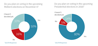
Yesterday was Election Day across the United States, and like most people I know, no one knew unless they saw the Snap story or swiped by it on Twitter. Sadly, it seems like this trend isn't changing. Youth (that is, people between the ages of 18 and 30) don't vote in Midterm Elections.

It seems as if young people have given up on the political process altogether. In the 2014 Midterm Elections, for example, the Youth turnout was just 21.5% (CircleYouth.org) The general consensus among America's younger generations is that, "The Government is corrupt. The system is rigged. Voting is pointless." However, I would argue that every vote counts.

The Electoral Map of 2000, a very close and partisan election
The 2000 Election was a bit before my time, but it's still a controversial topic among the public. If you're unfamiliar with that election or with American political history in general, it goes like this : George W. Bush won the Electoral Vote (Majority of States) while Al Gore won the popular vote. The state of Florida (with 25 electoral votes) was extremely close, so close that News Agencies couldn't even report who won on election night. It took a whole month of recounts before SCOTUS ruled that the recounting should stop, and at that time, Bush had won the popular vote in Florida, which means he won the state's electoral votes, thus winning the Presidency. If just 1,000 more people turned out to vote in Florida, Al Gore would have won the state and won the White House.

Yet it seems as if the American Public has forgotten this close election. In future Presidential elections, the voter turnout was higher, but for Midterm elections, this is not the case.

Youth vote intentions: Midterms vs POTUS elections 
The problem is, that during Midterms, the Congress is elected. Congress dictates policy, but it seems that the youth is under the impression that the President is all powerful, so they only vote for the POTUS, and not the Congress.  Then they blame the leader (Whether it be Bush, Obama, etc) for the problems in this country, when they can't do anything because the people who voted for the President didn't vote for the President's respective party in Congress. The people have the power to vote out Congress and elect new leaders, but they have given up on the process, or only voted for the top honcho.

To the Youth of America, if you're going to vote, vote in the Midterms and in the Presidential elections. If you have the opportunity to vote, and you refuse it, then you have no right to complain.

Wednesday, October 7, 2015

How to Put Michael Bay Style Explosions into Your Video

Alright, so we've all seen those Michael Bay movies. We know Bay loves his explosions and I know you do too. Today, I'm going to be showing you how you can import those effects into a simple editing software and add them to your project.

Now, the website I use to get my effects is footagecrate.com. Once you're there, you are going to want to scroll over to the "Video" tab and press the down key. You'll see that one of the links says "Fire/Explosions". Click on that and select a random fire or explosion effect. (For the purpose of this video, I will be using the "Slo Mo Explosion 3" effect.) Click download, trust me, it's safe, my computer isn't destroyed yet.

Next, open up your editing software. I don't have FinalCut Pro at home so I will be using iMovie (Just FYI, never use iMovie unless you absolutely have to. I would recommend using AfterEffects or Final Cut instead. )


Alright so now that you have it open, create a new project. (File> New Project) and put your footage on the timeline. Now what you're going to do is go (File> Import> Movies) and select your explosion effect you downloaded earlier. You're going to drag the explosion onto the footage, and then select the "Green Screen button". (Note: The explosion will not play in iMovie, but once it exports, it should be good). Adjust it however you want, and export.


Boom! You're ready to direct the next Transformers!

Whiplash gave us Whiplash

Damien Chazelle's Whiplash (which was just released at the end of last year) has received widespread critical acclaim. After watching it for the first time this weekend, I can attest that the hype isn't an exaggeration.

Whiplash tells the story of Andrew Neiman, a young relatable college student and drummer, who wants to become "one of the greats". One night, while practicing, Andrew is interrupted by Terrence Fletcher, the conductor of the university's top Studio Band. Fletcher eventually gives Andy a spot in the band and pushes him beyond his limit.  

On the technical side, Whiplash is very artistic. The camera angles are quick and numerous, featuring many gritty and uncomfortable close ups. The filter (a yellowish tint) is fantastic for setting the tone of the story. JK Simmons's performance merits an Academy Award (Heh) and Miles Teller plays a very convincing character. 

Whiplash has strong themes of dedication, leadership, and the film has many elements we all can relate to. All of us are like Andy. We want to be successful, rich, famous, whatever it may be, but we don't realize the effort we must put in to actually achieve these goals. Andy is overcome with stress and pain because of Fletcher's constant pushing, but he keeps going. I think that is a powerful message to send to your audience. To be a legend, you must pay the price. 

Monday, October 5, 2015

Newsnax: Not Necessarily Independent

The media (digital or otherwise) has a tendency to portray itself as politically unbiased. Newsmax, a fairly prominent internet news outlet, has the slogan "Independent. American." Yet, on the front page of the website, there was an article titled, "12 Reasons Ben Carson Would Make A Good President."

The article itself has a BuzzFeed style design. Bold, highlighted numbers followed by a non-sequitor. Number 2, for example, on the list claims that Ben Carson would be a good President because "He's not politically correct." The author does not explain why Dr. Carson would be a better President than his competitors, nor does it describe why political incorrectness is a prerequisite to a successful Presidency. This claim is simply is a talking point, that is put in an article to make it seem like it is a relabel and accurate assertion. The author does not end the article with a conclusion, she ends after finishing reason Number 12. 

Anyone unfamiliar with Ben Carson will most likely not be swayed to support him based on this article. I am sure that this author is familiar with rhetorical devices, as she does use anaphora for almost every bullet point, and she probably is a good writer, but this article was written to rile up conservative voters and to make a quick buck. This has become a gigantic issue in the digital media. There is no editorial point of view, so Newsnax loses validity when they post an article like this.  If someone wants to write a political article supporting someone, that's fine, but don't post it on a website that claims to be independent. 

http://www.newsmax.com/TheWire/ben-carson-good-president-reasons/2015/05/04/id/642490/

Friday, March 27, 2015

Responsive Web Design

Responsive Web Design

Responsive websites are sites that change their layout depending on what device you are using and responsive web design is a way to make your website more accessible to users on other platforms.  Up until the past few years, websites have been designed for people using desktops or laptops, but now, with new innovations like Smartphones and tablets, web designers are now encouraged to 3 websites in 1 for mobile, tablet, and desktop users.

A couple of terms you'll need to know before we get started are breakpoints and media queries. Media Queries are a form of CSS module that allows content to adapt to different width, height, and screen resolutions. A breakpoint is where each change happens.


The example site I used was Nixon.com, the watch company.

As you can see, Web Designers at Nixon have created a well reacting, responsive site so that all users may search the site with ease. The original  image is the largest and this is the front page of the site when people browse with a desktop or laptop.


The second image is what Nixon's site would look like on a tablet. There isn't too much change, but the side images are moving closer in and their isn't much blank space in-between the
advertisement for the Kingpin watch and the side logos.


The final image is what it would look like on a mobile platform. Notice how the entire layout has changed. The layout is much simpler (you can read more about why mobile sites are often simpler in
my previous blog) and the graphics have gotten much smaller. Everything you need is on the front page.


Wednesday, March 25, 2015

Mobile and Desktop Trends


In the last several years, the world has been overtaken by smartphones. Today, 91 percent of American adults have a mobile phone and most of them have internet capabilities. The gap between  desktop and other devices usage for browsing the web has  narrowed  considerably. The ONW Ravens website has also seen a jump in visits from mobile sites. Two years ago, the percent of people visiting ONW's website on a mobile phone was around 14 percent. Today, it's nearly 35 percent.

ONW's statistics are far from unusual. Mobile usage is  growing exponentially and according to Smartinsights.com,  last year was the tipping point. Now, more people use mobile phones for surfing the web, than they do on desktops.

There are some other aspects to be taken into consideration. When using a mobile phone, we generally have an idea what we are looking for. All sites suffer from high bounce rates (meaning people jump off the site after browsing one page) As a result,  web designers now have to find ways to showcase their content in a simple, but interesting way.